Every year, millions of Americans quietly vote with their feet, leaving declining places behind and betting on new ones. But the signals that tell you which places will be the winners and losers of tomorrow are scattered across dozens of disconnected and lagging sources, each capturing only a fragment of the real picture.
AlphaGeo’s Net Gravity Score (NGS) closes that gap at the census-tract level. The score combines three layers – a structural base built from nearly twenty push and pull variables, a sentiment layer based on news media coverage, and a spatial layer that accounts for the performance of surrounding areas – together generating an analysis that reflects both how migration decisions are actually made and anticipating which places have the highest and lowest attractiveness.
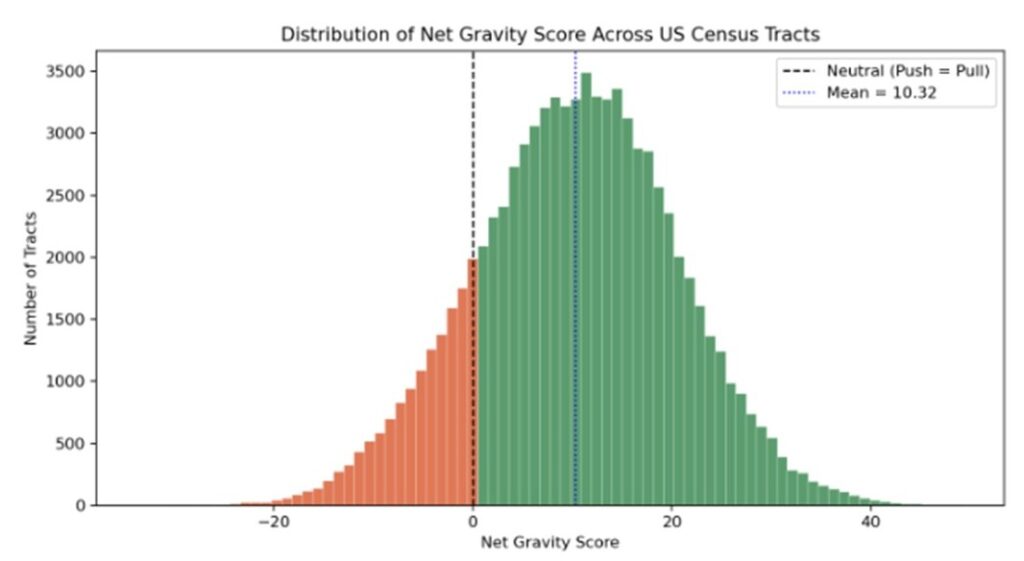
The figure below plots all of America’s 83,634 census tracts by their Net Gravity Score. It reveals a distribution that is right skewed (with a mean of +10.3), reflecting the country’s overall population growth. 84% of census tracts show net-pull characteristics, asserting migration attractiveness, while only 16% show net-push conditions — out-migration pressure mainly concentrated in the South and pockets of the West Coast.
The pull effect in our model is 4.09× stronger than the push effect. This asymmetry reflects a real, measured effect: people move toward opportunity faster than they flee trouble. Places that create jobs and opportunity draw people in far more forcefully than struggling places push them out. This isn’t a quirk of this dataset; it independently corroborates Olney & Thompson (2024, NBER), who found a comparable ~2.2× destination-dominance effect using entirely different data.
Numbers only tell half the story — the map below shows exactly where that gravity is pulling. Plotting NGS across every county reveals geographic macro-trends invisible in a histogram: how structural factors, sentiment, and spatial dynamics filter down differently across the country, county by county.
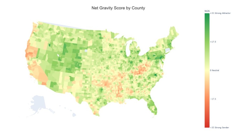
The Mountain West and Plains form the most durable attractor zone on the map, not the Sunbelt or the coastal tech hubs. Idaho, Montana, Wyoming, Colorado, and Utah show a continuous block of strong positive scores driven by lower state income taxes and lower climate risks, among other factors. Income growth and job creation sit close to the national average across the region, indicating that tax and climate advantages are doing more of the work here than economic momentum.
The Great Lakes and Rust Belt states show a patchier, metro-anchored pattern. Rather than uniform regional strength, states like Ohio, Illinois, Indiana, and Michigan show mostly neutral territory punctuated by strong, tightly bounded metro counties. Franklin County (Columbus), DuPage County (Chicago suburbs), and Oakland County (Detroit suburbs) all post scores well above their state’s baseline. The pull here is concentrated in specific metro cores rather than spread regionally.
Structural out-migration concentrates in three identifiable clusters. Central Appalachia is the most concentrated red zone nationally, where unemployment, poverty, weak job creation, and lower education levels compound into the strongest push signal in the country. Coastal California tells a different story where housing-to-income ratios extreme enough that even strong income growth can’t offset the affordability penalty (in clear contrast to greener inland California counties). The Mississippi Delta rounds out the picture, driven by the same combination of high unemployment and high poverty that’s dragging down Appalachia.
Florida’s split is metro-vs-rural, not coastal-vs-interior. Orlando, Tampa, and the coasts anchor the state’s strongest counties, while rural interior counties — Marion, Sumter, Highlands — trail well behind, even though they stay net-positive. The pattern is a clean illustration of the spatial layer at work: gravity clusters around metro and lifestyle-rich corridors, not evenly across state lines.
Texas’s strength is concentrated in the Dallas–Austin corridor (Collin +25.9, Travis +24.1, Dallas +21.4), with San Antonio, Houston, and El Paso trailing at more modest positive scores (+10 to +12). The weak end splits into two clusters: Rio Grande Valley border counties (Starr -9.6, Webb +5.8, Hidalgo +6.9) and rural East Texas’s Piney Woods counties, both trailing well behind the state’s median. It’s metro growth radiating from Dallas and Austin, not a statewide boom.
The below chart shows the strongest attractors vs. strongest repellers at the county level.
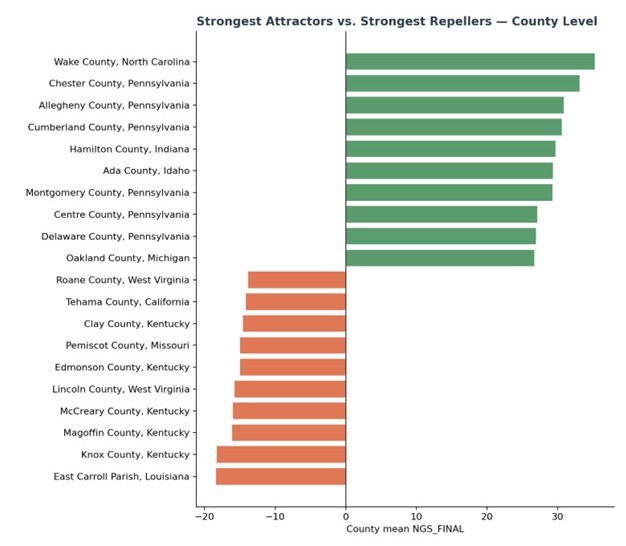
The strongest and weakest counties in the country tell two different geographic stories. At the top, growth isn’t concentrated in one booming region, it’s scattered across five distinct metro areas, each pulled by its own fast-growing suburban ring: Raleigh (Wake County), Philadelphia’s collar counties (Chester, Montgomery, Delaware), Pittsburgh (Allegheny), and suburban Detroit (Oakland). At the bottom, the pattern is far more concentrated: six of the ten weakest counties nationally sit in Kentucky or West Virginia, a real regional cluster rather than scattered outliers, with East Carroll Parish, Louisiana registering the single lowest score in the country. Even the magnitudes tell a consistent story — Wake County’s peak (+35) pulls further from zero than East Carroll’s low (-18), echoing the same asymmetry seen across the full dataset: pull effects on migration run meaningfully stronger than push effects, so the strongest attractors stand out more sharply than the weakest repellers.
Three layers, three very different weights
That geographic pattern is really the output of three separate forces working together — structural conditions, local sentiment, and spatial spillover. The three layers don’t contribute equally, and each leaves its own fingerprint on the final score. Structural conditions have the widest spread and, on a tract-weighted basis, accounts for roughly 71% of the average tract’s final score. Sentiment contributes a narrower band — bounded to roughly ±3 points at the extremes — averaging about 14% of the tract-level score, while spatial contributes a similar 15% and is the layer most responsible for smoothing out noisy structural swings between adjacent tracts.
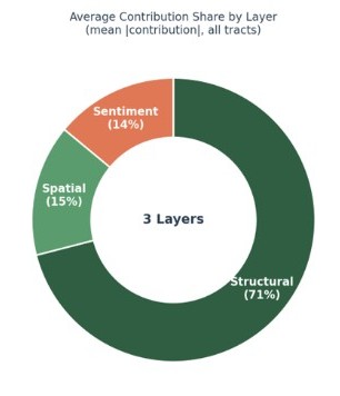
How the layers stack — Every score comes with an answer
Most migration scores give you one number and stop there. NGS shows exactly which force produced it: structural fundamentals, local sentiment, or a neighbouring tract’s momentum. That’s the real differentiator: not just a better score, but a score you can interrogate.
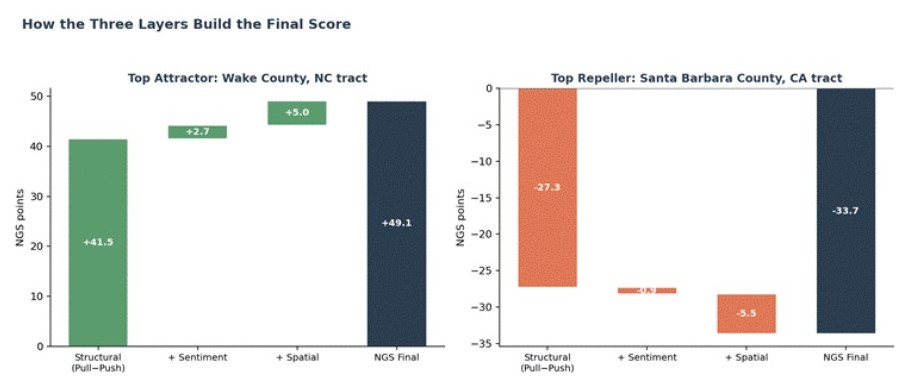
To make the three-layer mechanism concrete, here’s the breakdown for the two extreme locales. The highest-scoring tract in the country, in Wake County, NC, begins at a structural +41.5, and sentiment and spatial context both push it higher, a place where the news and the neighborhood agree with the fundamentals. The lowest-scoring tract in the country, in Santa Barbara County, CA, begins at a structural -27.3, and again sentiment and spatial reinforce rather than offset it. At both extremes, all three layers point the same direction, which is exactly why these two tracts sit at the very top and bottom of the national ranking.
The more revealing cases are where the layers disagree, lending insight into the role each factor plays in isolation. A tract in Butte County, CA and a tract in Richland County, SC show exactly that. Butte’s mildly positive structural score (+4.15) gets overridden by negative wildfire-driven sentiment and a struggling surrounding region, flipping it to -0.20, while Richland’s mildly negative structural score (-4.42) gets overridden by positive local news and a stronger neighboring context, flipping it to +0.71.
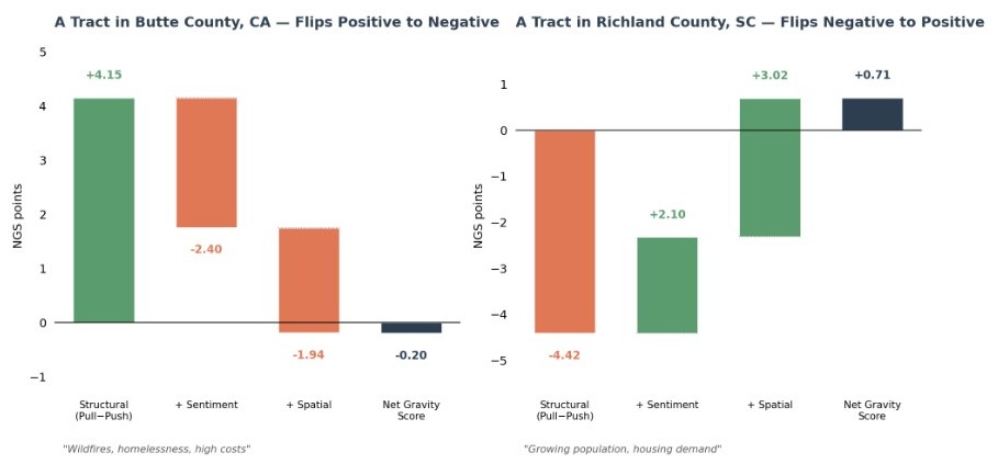
Read side by side, the four tracts demonstrate that sentiment and spatial context aren’t just noise riding on top of the structural score. They can reinforce a strong signal at the extremes, or override a weak one when the underlying fundamentals are genuinely close to neutral.
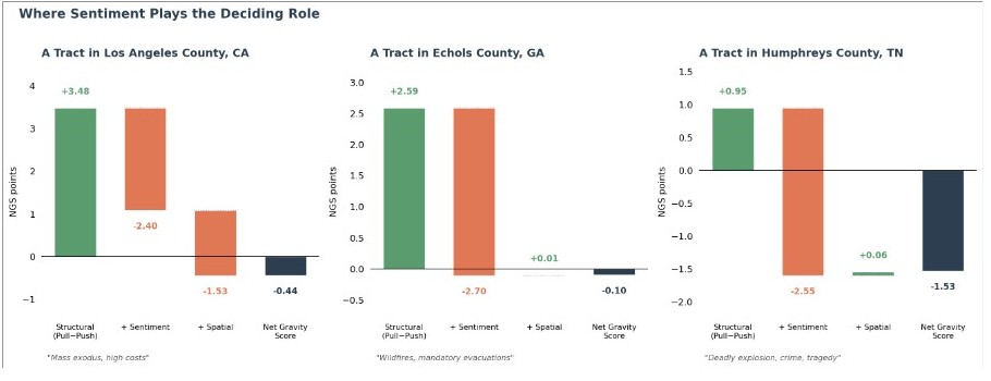
Where sentiment plays the deciding role: a tract in Los Angeles County has mildly positive fundamentals (+3.48), but a well-documented “mass exodus, high costs” narrative in the news drags the final score to -0.44 — sentiment (-2.40) outweighs spatial (-1.53) and manages to flip an otherwise mildly positive structural read into a net-repeller. A tract in Echols County, GA is the cleanest single-layer case in the dataset: fundamentals are mildly positive (+2.59), spatial contributes almost nothing (+0.01), and it’s sentiment alone — “wildfires, mandatory evacuations issued” — that flips the score negative. Humphreys, TN is similar at the county level: fundamentals are essentially flat (+0.95), and news of “a deadly explosion, crime, tragedy” drags the score to -2.55 on its own, with spatial contributing next to nothing.
Where the neighbourhood plays the deciding role: a tract in Onondaga County, NY (Syracuse) has mildly negative fundamentals (-2.74), but flips to +2.71 mainly because neighboring tracts are also riding the semiconductor industry investment — spatial (+3.36) outweighs sentiment (+2.10) here. Heard, GA is the cleanest spatial-only case: fundamentals are weak (-0.21), sentiment contributes exactly zero (no usable news signal), and its proximity to booming Atlanta-exurb counties alone that pulls the county to +0.57.
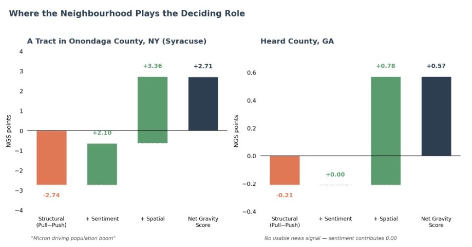
A lagged population count or a single-variable proxy would show you the same final number for a tract in Humphreys, TN and for Heard, GA overall, and give you no way to tell that one is reacting to a news event and the other is riding a neighbor’s momentum. NGS’s three-layer structure means every score comes with an answer to the next question a client asks: why?
Those tract-level examples show the layers working in isolation but the real stress test for the model is what happens at scale when two neighboring counties share almost everything except their score.
Adjacent counties, real divergence
The cleanest evidence that NGS measures significant drivers comes from adjacent-county pairs, places that share a border, climate, and regional economy, but nonetheless pull apart in the score.
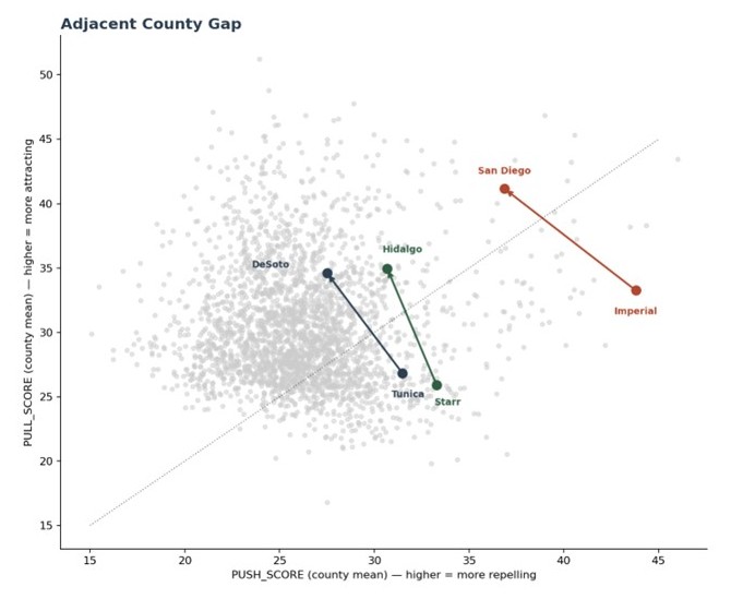
- Imperial → San Diego, CA: a 17.7-point gap between neighboring counties. Imperial’s unemployment contribution (-6.12) is tied for the single most extreme push value anywhere in the country. Sentiment contributes exactly 0.00 to this gap — this is a pure structural-and-spatial story, not a media narrative effect.
- Starr → Hidalgo, TX: a 16.6-point gap between two South Texas border counties. Hidalgo’s advantage traces to McAllen acting as a regional employment anchor, reflected in both lower unemployment and lower climate-risk contribution.
- Tunica → DeSoto, MS: an 18.4-point gap where, unlike the Imperial/San Diego case, sentiment does a meaningful share of the work (+4.95 points of the gap) — a case where the news narrative and the structural fundamentals move together.
These three pairs raise an obvious next question: across the whole country, not just these three borders, what’s actually driving the scores?
What drives the structural score?
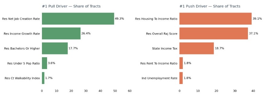
Rolling up every tract’s top pull and push factor nationally: Net Job Creation Rate leads 49.3% of all 83,634 tracts — essentially half the country — with Income Growth Rate a distant second (26.4%) and Bachelor’s-or-Higher education third (17.7%); no other pull variable leads more than 3.6%. On the push side it’s a near-tie between Housing-to-Income Ratio at 39.1% and Climate Risk at 37.1%, with State Income Tax third at 18.7%. The single most common reason a place attracts people is jobs, not lifestyle amenities. Also, housing costs alone don’t tell the whole push story since climate risk carries just as much weight.
What drives the sentiment score?
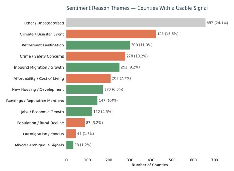
Sentiment themes, tallied across the counties with a usable news signal, tell a clear story: climate and disaster events are the single largest identifiable driver of sentiment nationally, at 15.5% — ahead of every economic theme, including affordability (7.7%), jobs (4.5%), and even outmigration itself (1.7%).
Retirement destination framing (11.0%) and crime/safety concerns (10.2%) round out the next tier, with new housing development, rankings and reputation mentions, and inbound migration/growth each contributing smaller but meaningful shares. The “Other/Uncategorized” bucket at 24.1% isn’t a data quality problem, it reflects genuine long-tail diversity in how local news actually talks about a place, from labor disputes to detention center controversies to eccentric local landmarks, the kind of granular, idiosyncratic coverage no fixed taxonomy can fully capture.
Read together, the theme breakdown reinforces the point made earlier: local sentiment is driven by real, event-specific news, not smooth regional narratives — and climate risk, more than any other single theme, is what’s actually shaping how the country talks about its own migration story.
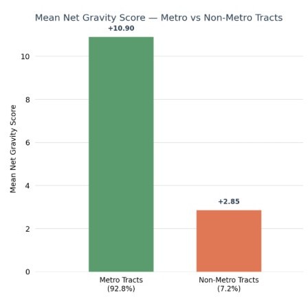
Is NGS a Metro Story?
Metro tracts average +10.90; non-metro tracts, +2.85 — nearly an 8-point gap. 85.4% of metro tracts are net-pull versus 67.4% non-metro. Migration pressure in America concentrates around metro infrastructure: job creation, income growth, education, and investment all cluster there.
Non-metro areas aren’t just missing jobs; they’re missing the ecosystem jobs depend on and the positive local news coverage that ecosystem generates. People don’t avoid rural places specifically. Metro areas offer a self-reinforcing cluster of opportunity, infrastructure, and reputation that non-metro areas structurally can’t replicate alone.
NGS Against Historic Patterns
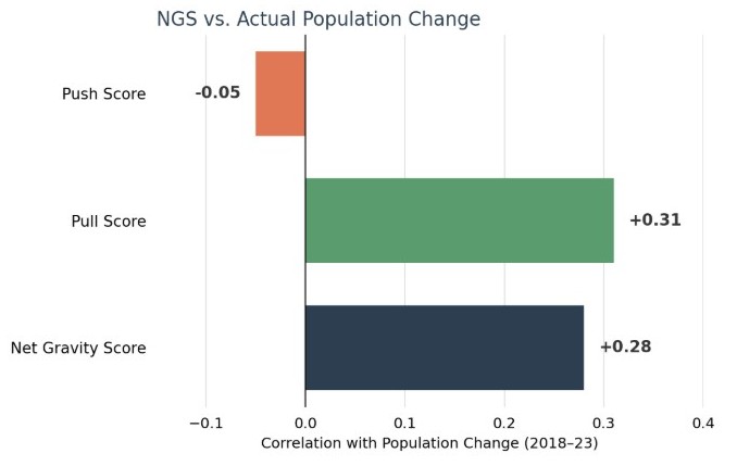
NGS reflects real-world migration patterns, as verified by its correlation with historical population change in ACS 2018-2023 data. NGS moves with population growth (r = 0.28), and the same pull-dominant pattern seen throughout this analysis appears here too. Pull (r = 0.31) tracks growth far more closely than Push (r = -0.05), consistent with the broader finding that people move toward opportunity faster than they flee distress. Places NGS identifies as strong attractors are the places that actually grew, confirming that the score tracks real population movement.
Conclusion
Taken together, NGS is more than a single score — the composite can be used as-is or broken into its independent layers as needed. Structural drivers give provide a read on the fundamentals, free of news volatility. Sentiment gives a fast-moving, real-time signal. Spatial shows how strongly an area rides on its neighbors’ momentum.
That flexibility drives real use cases. Investors can rely on NGS’s structural output alone to screen submarkets without news-driven noise; policymakers can track NGS’s sentiment output to catch a deteriorating local narrative before it hits next year’s labor data; planners can use NGS’s spatial output to flag counties benefiting from a neighboring investment early. One proprietary system, delivered as a single composite score or unbundled into its individual layers.
To read the full NGS methodology, visit https://docs.alphageo.ai/macro-suite/location-dynamism-signals-us-only/net-gravity-score.